Emerald Origins
How A Pandemic Uprooted Telemedicine
In 2021, the cannabis industry was ripe for innovation. Traditional consultations were inconvenient and often lacked educational resources for patients. The pandemic acted as a catalyst, driving the need for a more secure, accessible, and informative approach.
My Role
As Product Designer, I led the brand strategy, UX and UI design, and front-end development of the marketing site.
UX Research & Ideation
Translated research insights and feedback into actionable product requirements
Brand Strategy & Vision
Created stakeholder alignment through brand documentation and design systems
Design Execution & Validation
Delivered wireframes, sitemaps, mockups, prototypes, and web development
Collaboration & Coordination
Worked with external teams responsible for the marketing and portal development
Untangling the Market Maze
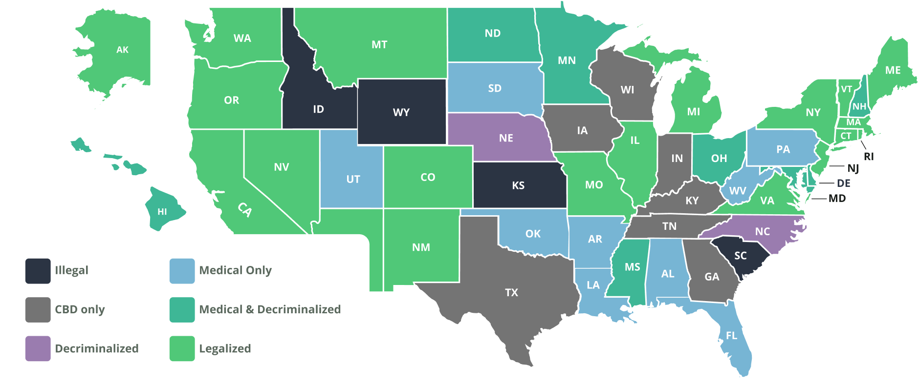
The market was new and growing fast which presented several challenges including a patchwork of legislation and technology gaps. Traditional EMRs were costly, didn’t accommodate alternative treatments, and existing 3rd-party solutions posed threats to patient security.
Discovering Opportunities
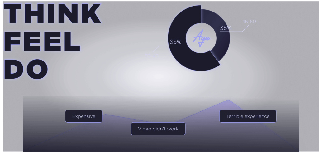
A three-pronged research approach was used to uncover competitor objectives and inform user needs through surveys and interviews with patients, physicians, and dispensary managers. This revealed crucial insights into who our users were, how they discovered the service, and what factors were important to them.
From Research to Reality
Users discovered competing services through organic search, referrals, and social media. Information was available online, but patients often had unanswered questions. During the negative sentiment analysis, this led to a perception of high cost and low value for most competitors. The emerging patterns helped shape the business objectives that became the foundation of the product strategy.
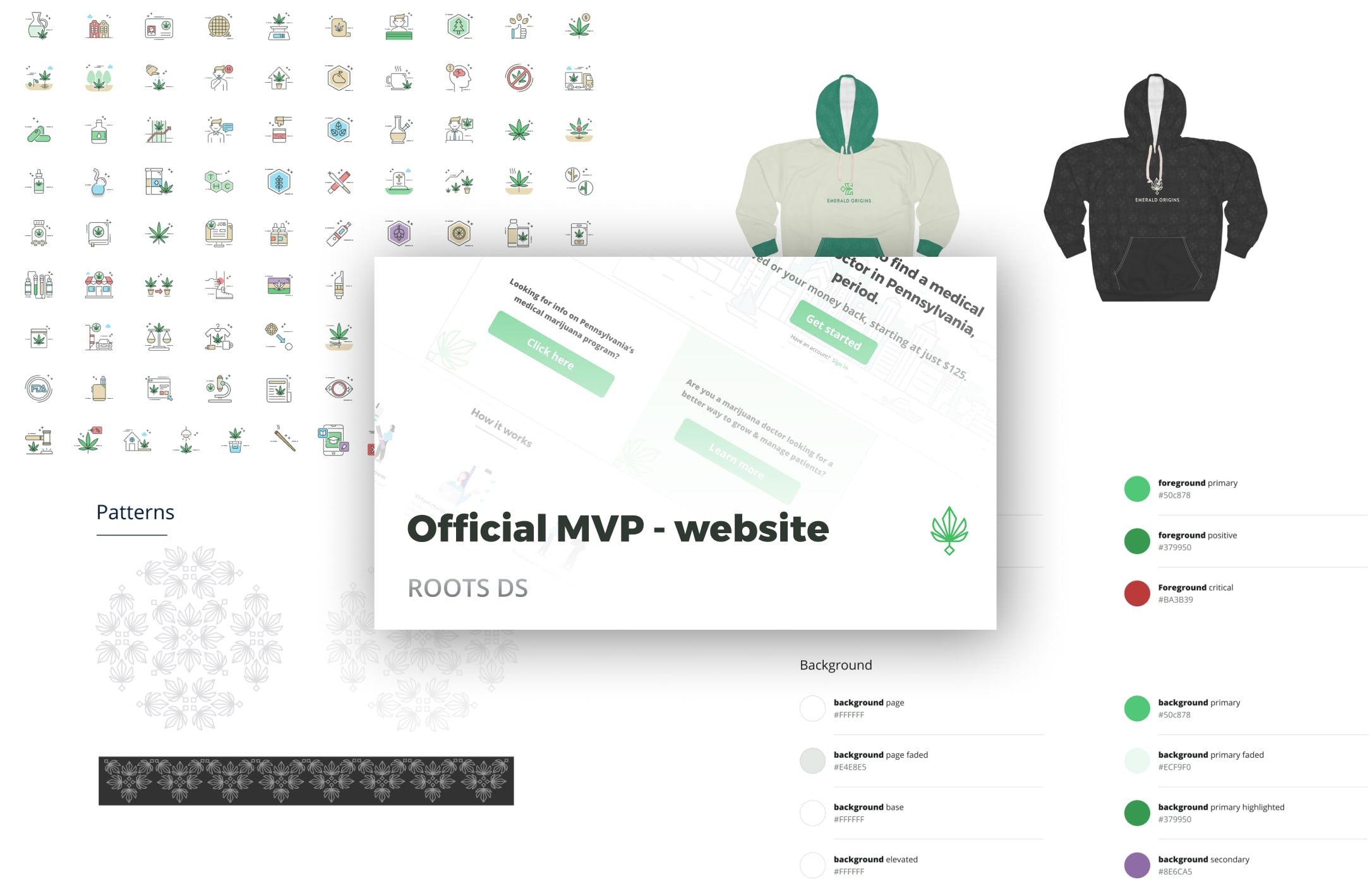
Bringing a Brand to Life
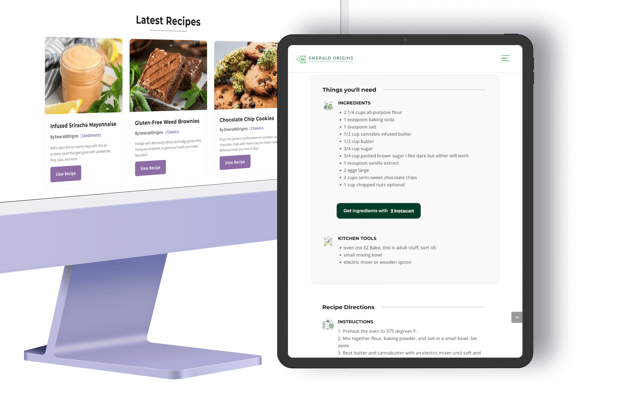
Drawing on user feedback and inspiration from nature a palette was developed bringing a new level of harmony to the icons and graphics which was later noted by users as appearing more professional than stock photos.
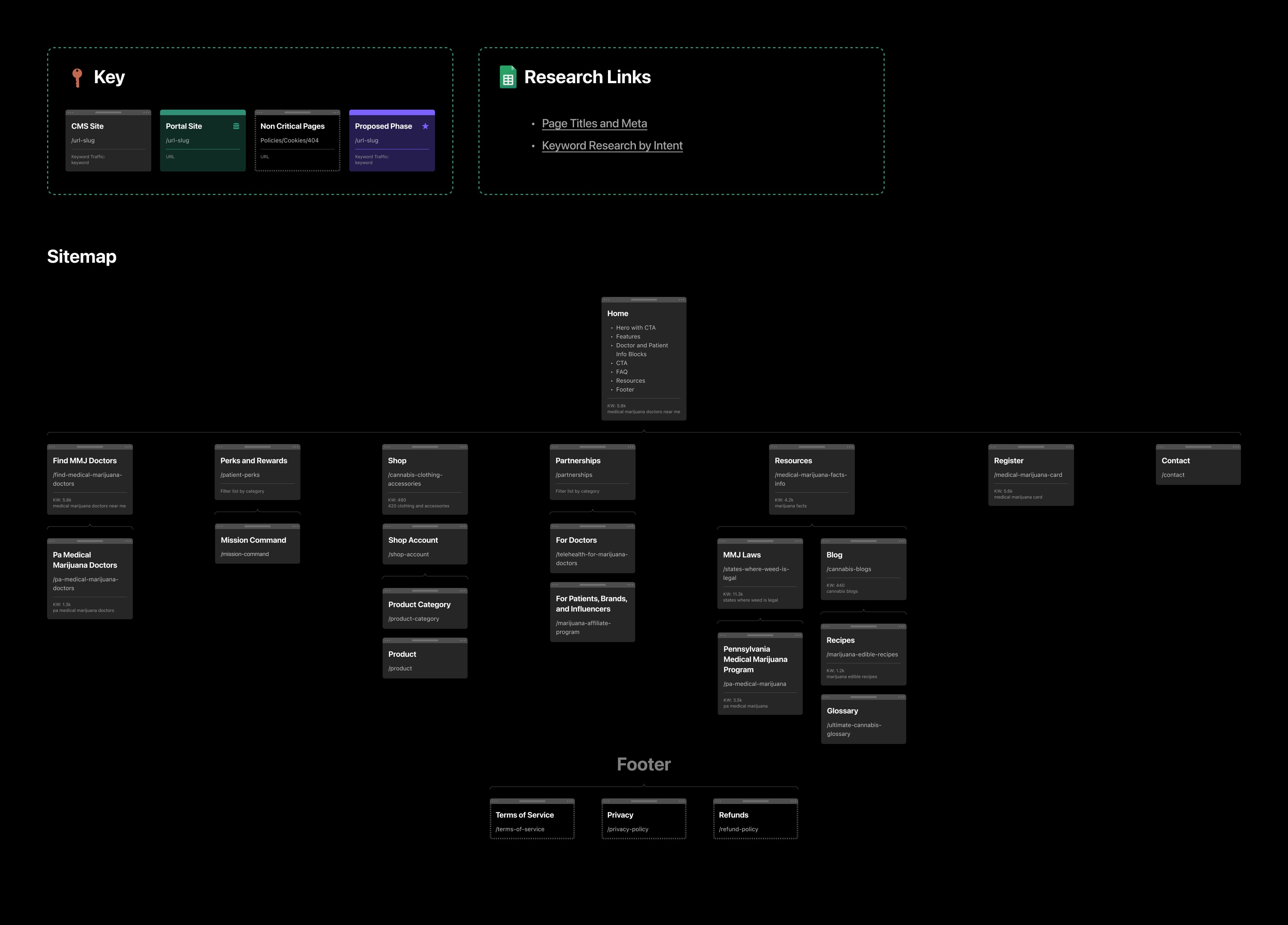
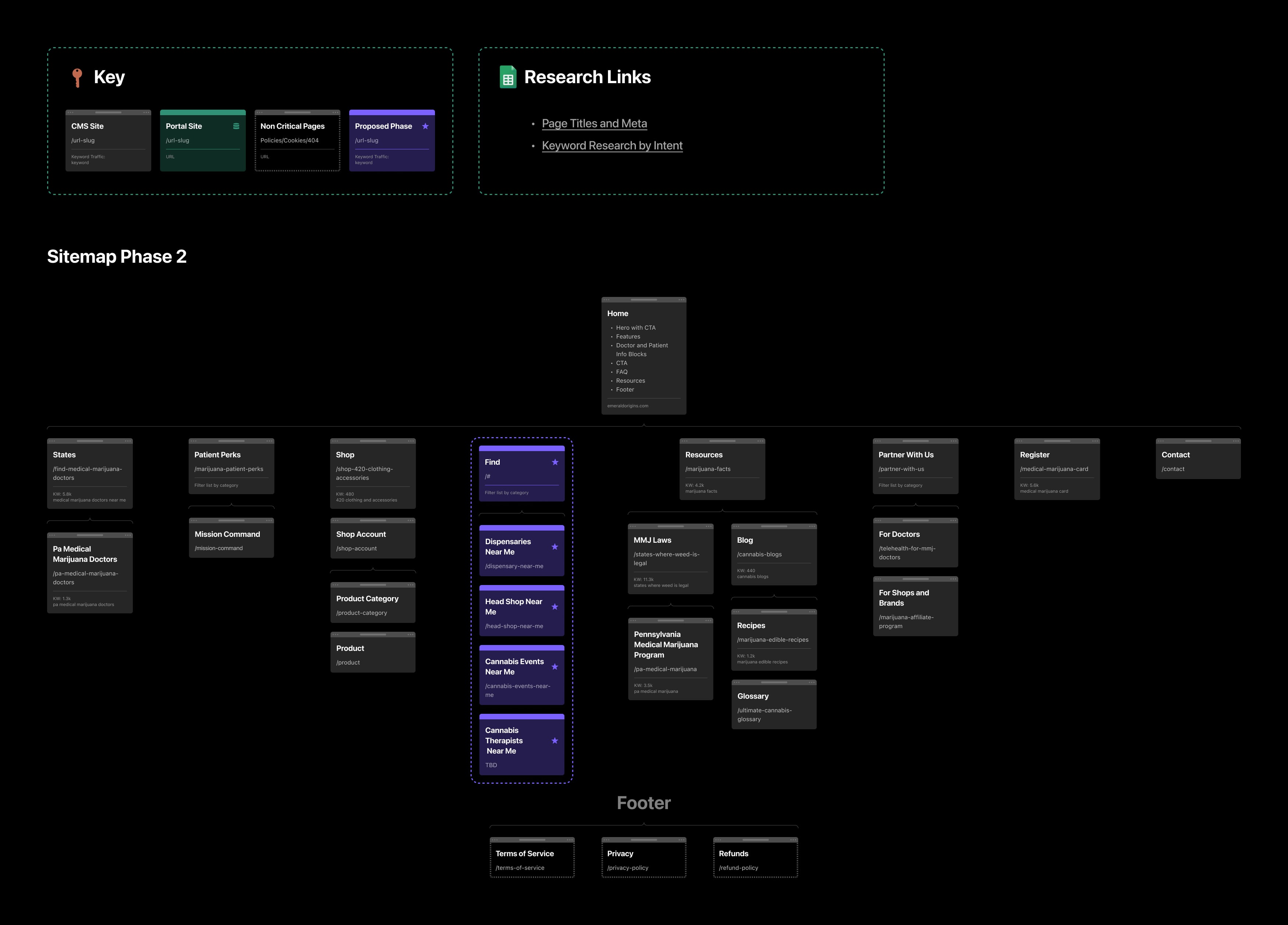
Building a Cohesive User Experience
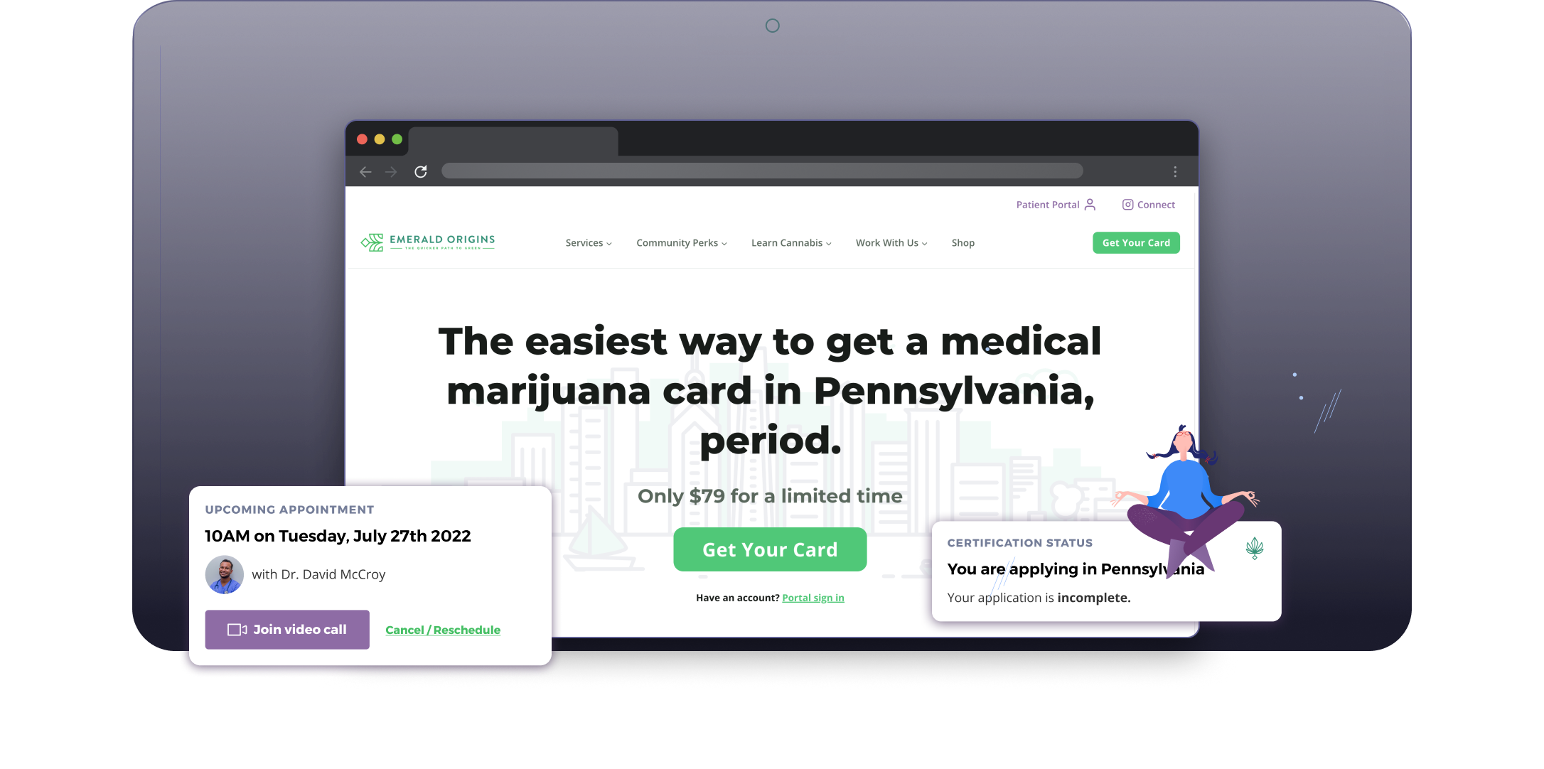
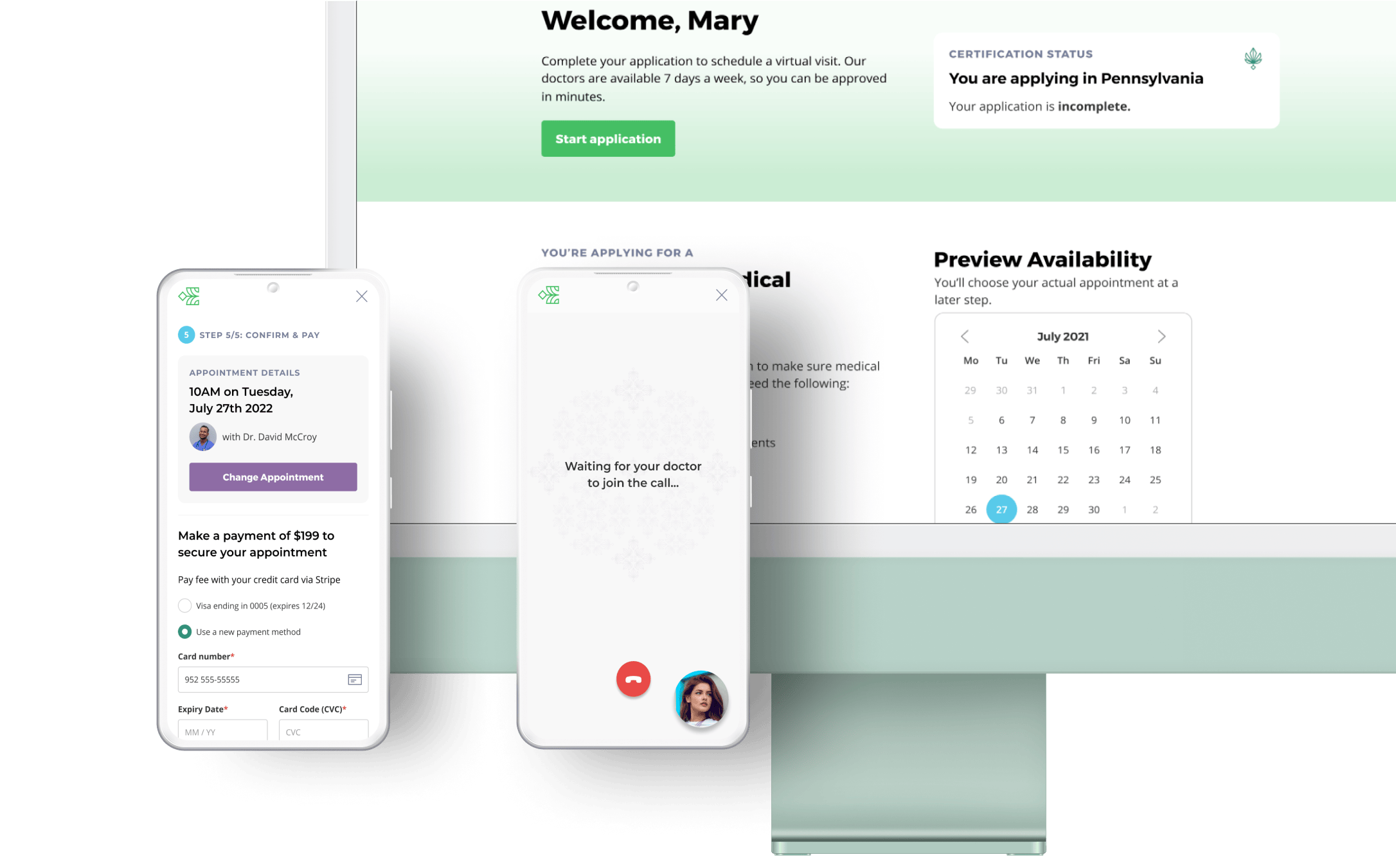
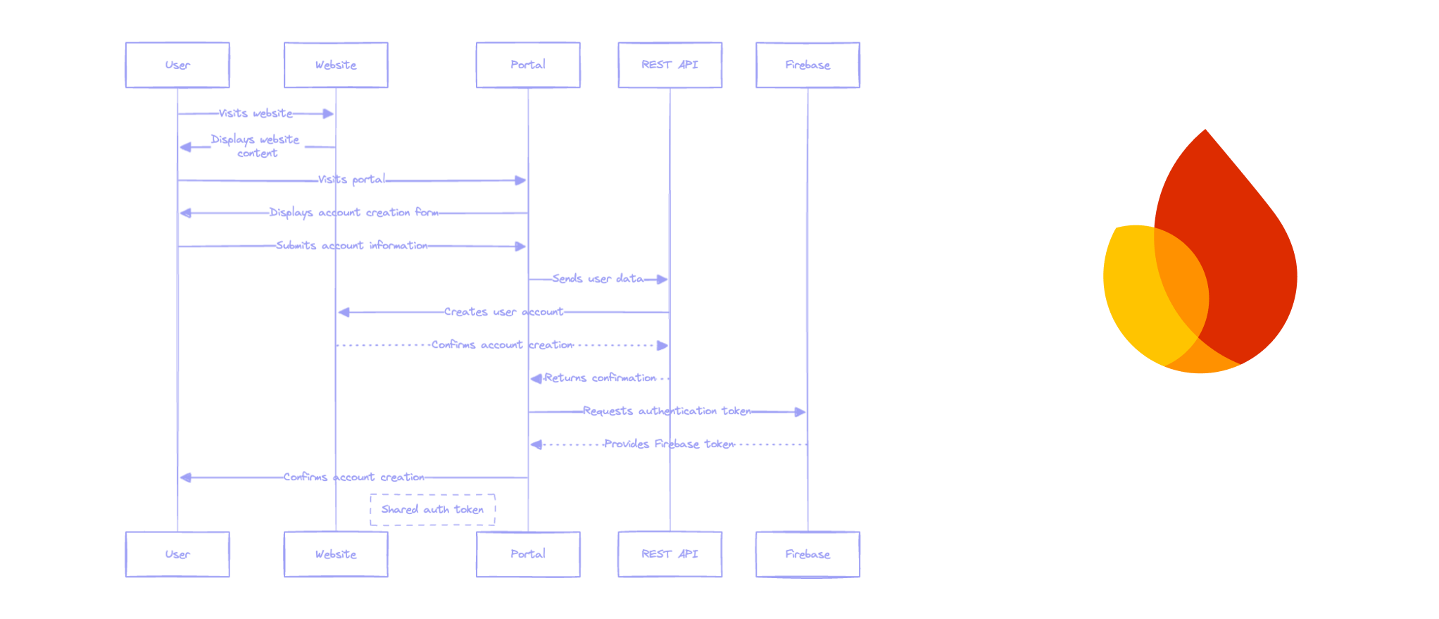
To secure patient data the platform consisted of two parts: a marketing website and a secure telehealth portal, each with their own database. This presented the unique challenge of ensuring a seamless user experience between the sites while working within the gamification constraints.
Through a successful collaboration with the backend developers, we created a frictionless experience using cookies to link registrations and logins while allowing us to hook into the actions and satisfy the constraints.
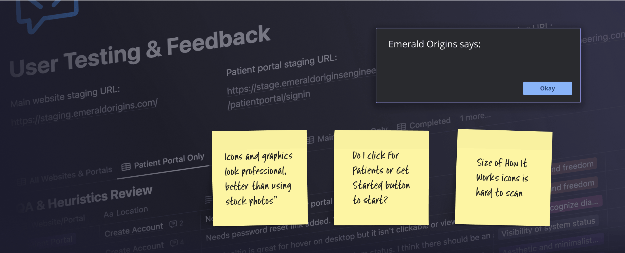
Testing, Tweaking, and Triumph
The collaborative and detailed QA process were pivotal to the project’s success and testing provided invaluable feedback allowing for interface refinement to ensure a great experience for all users. Heuristics evaluations were conducted on the website, patient portal, and physician portal revealing a few critical UX bugs to address like empty system alerts and some confusion around getting started.
Iterations and Improvements
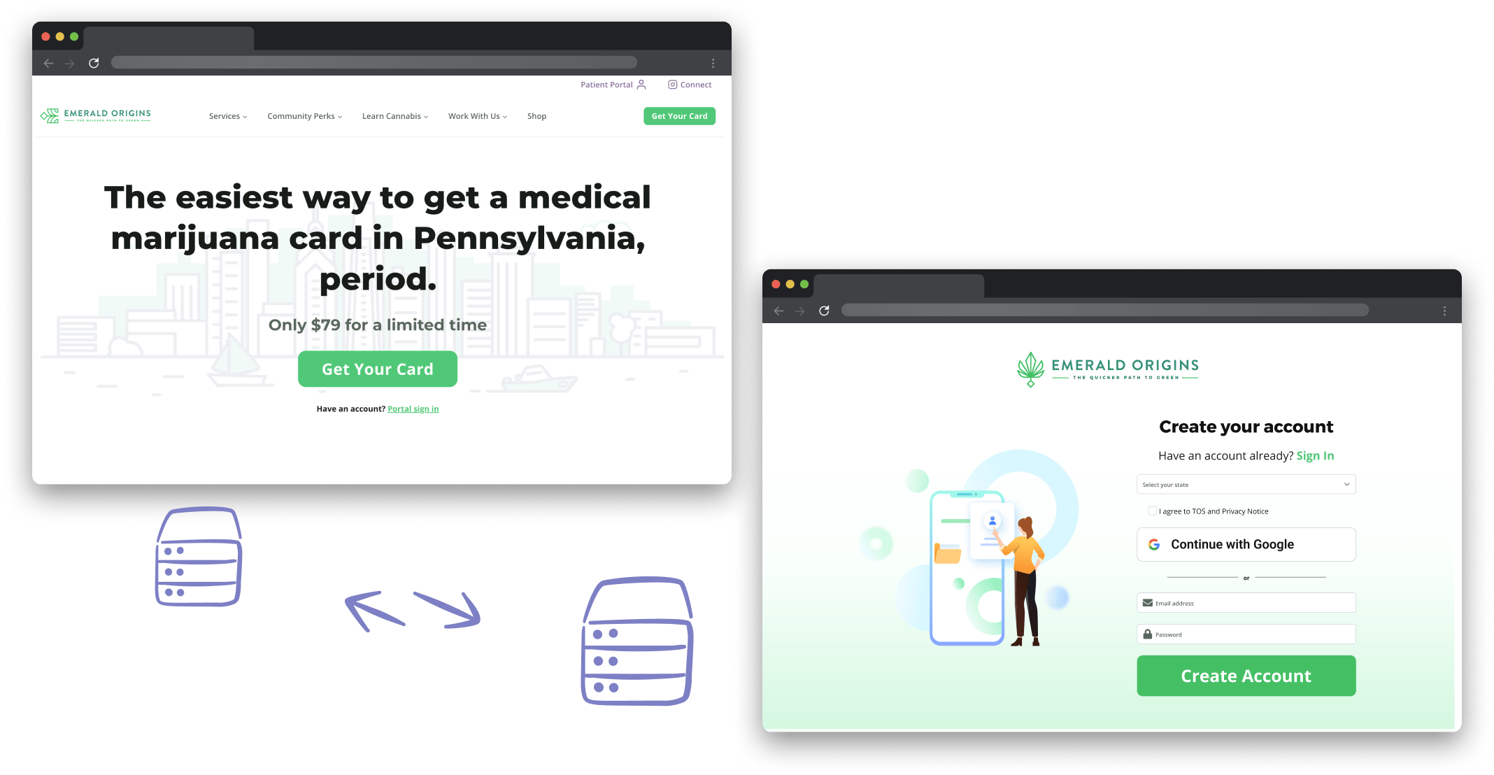
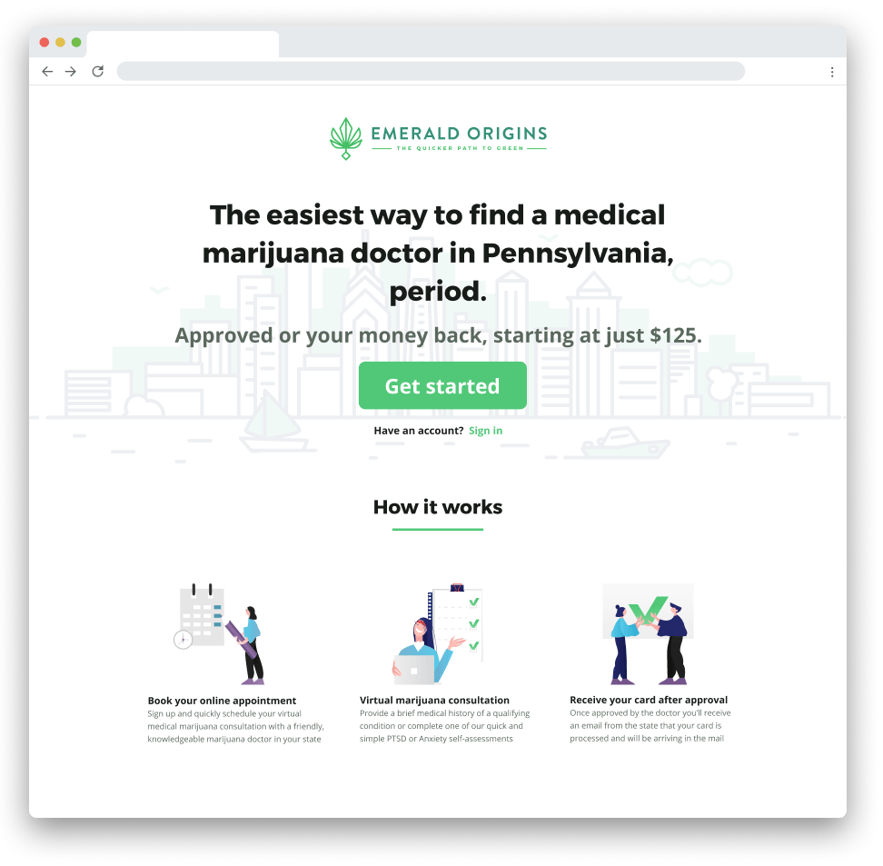
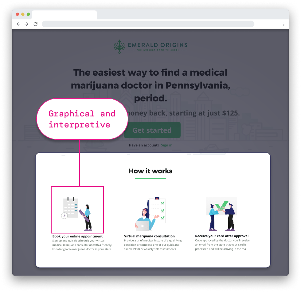
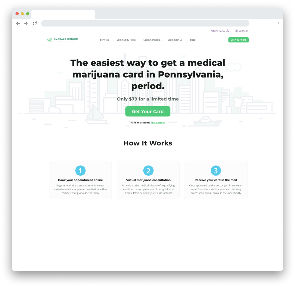
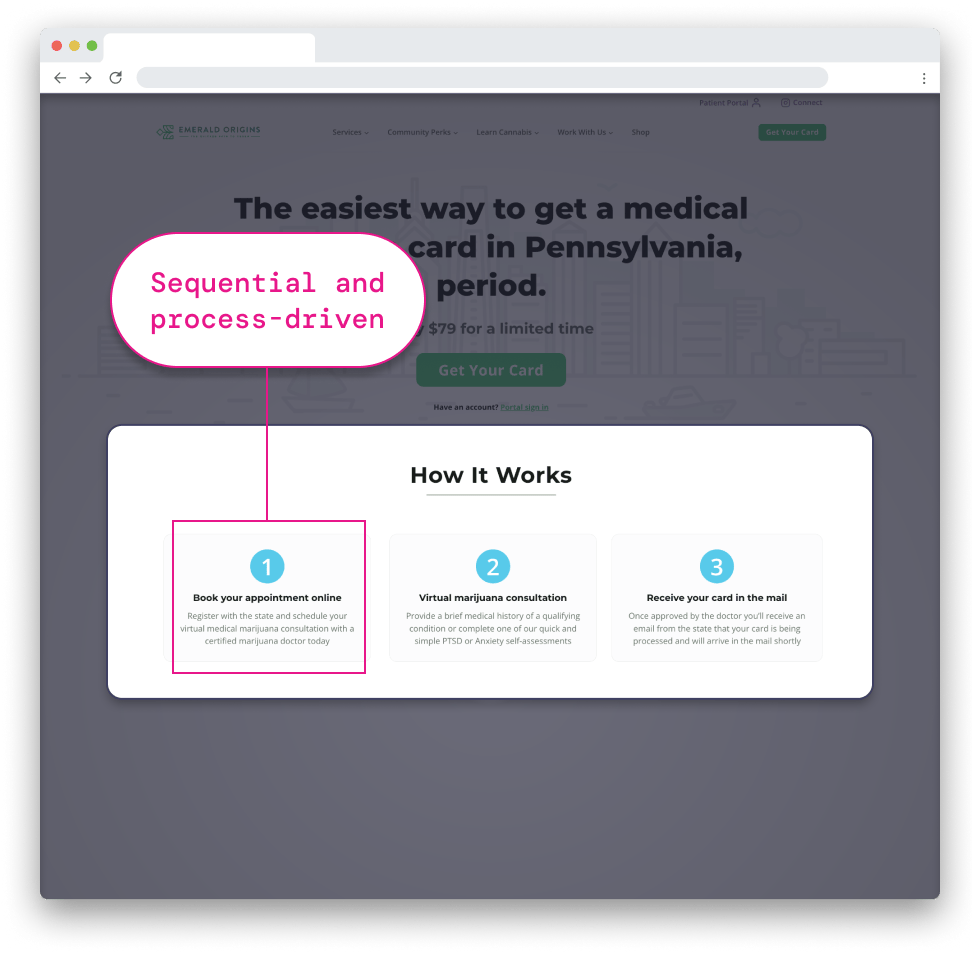
The landing page evolved through multiple iterations to achieve a streamlined design that emphasized user actions and intent. The initial version (Figure 7.0) used an illustrative and interpretive approach to explain the state-specific processes users needed to follow. Given the critical importance of users completing steps in the correct order, the final version (Figure 7.1) adopted a sequence-driven layout to clearly highlight this progression. We added navigation to allow users to explore the site before committing to a decision. With additional time, A/B testing would have been conducted to measure the impact of these changes on conversion rates.
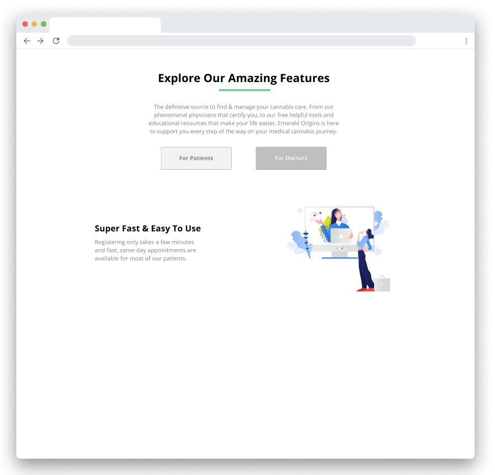
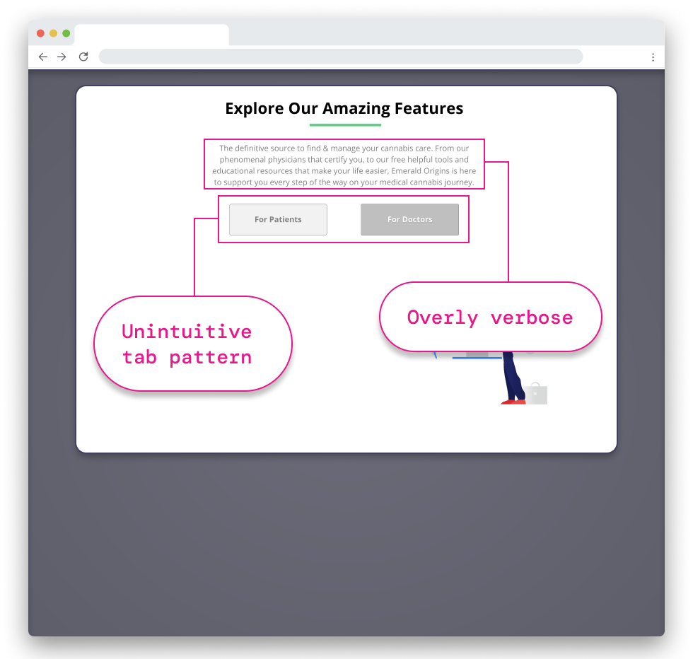
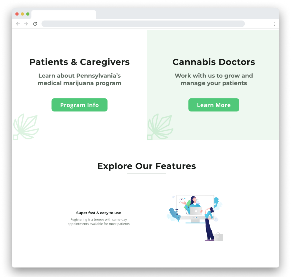
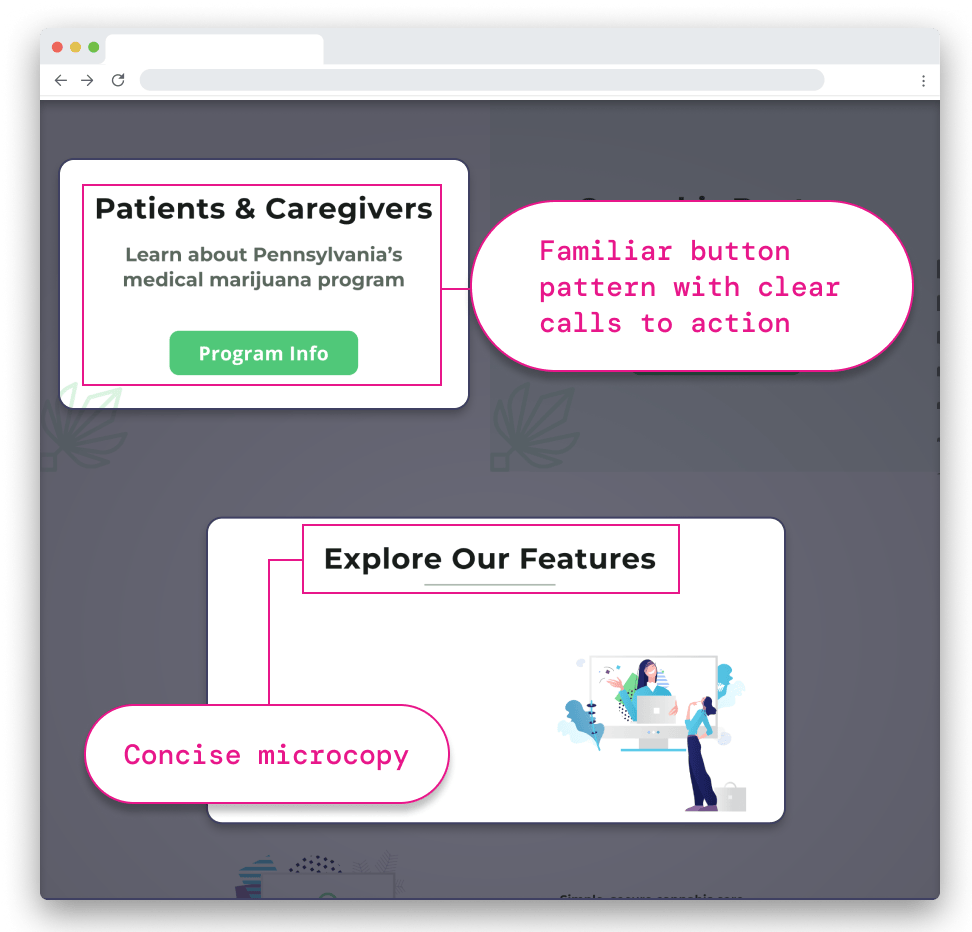
The initial features section (Figure 7.3) employed a tab-based design to toggle between patient and doctor information. However, early user testing revealed this approach caused confusion and failed to align with user intentions. In response, separate pages were created for patients and doctors (Figure 7.4). Each page now features clear calls-to-action and navigation to essential resources tailored to the user’s early journey. Additional refinements included optimizing microcopy and standardizing graphic styles to align with the brand, resulting in a more cohesive interface.
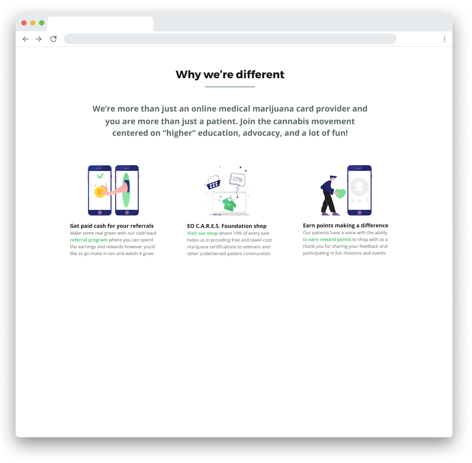
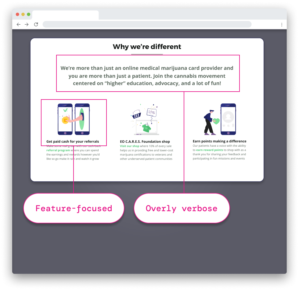
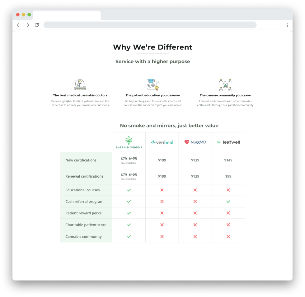
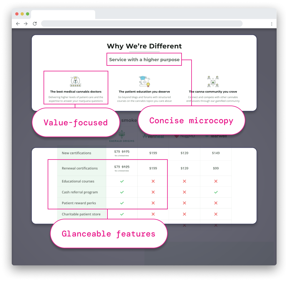
The “Why We’re Different” section initially (Figure 7.5) focused on explaining Emerald Origins’ unique features, such as the referral program and gamification elements. However, this approach didn’t fully capture the company’s core mission and principles. The final iteration (Figure 7.6) addressed this shortcoming by emphasizing the fundamental values driving the user experience. We presented feature highlights in an easy-to-scan table below, striking a balance between communicating the company’s ethos and showcasing its distinctive offerings.
This project exemplified the dynamic nature of startup environments, requiring constant adaptation to evolving challenges. While external constraints ultimately led to the startup’s closure, our team demonstrated remarkable agility in developing a sophisticated platform under pressure. I’m proud of how the brand evolved into a solution that prioritized clarity and ease of use for patients navigating a highly complex and regulated industry.
Ready to leverage my unique perspective and proven skills?
I’m available for full-time and freelance roles.